Wednesday, August 4, 2010
Back Where We Started...
drawing flowers, this time hydrangeas from my garden. I would have drawn more, but it started to rain.
Tuesday, August 3, 2010
Monday, July 26, 2010
Monday, July 19, 2010
Map for Project 3
Here's my map at Stage II. The idea is for WUNA to have a map the promotes the "neighborliness" of the area as well as gives a nod to its history.
The logo in the upper left is the real WUNA logo. I don't think it's very pretty but since it exists I used it. I'm not thrilled with my little buildings. Ideally, I'd like to have tiny outline sketches of the actual buildings but I think that would be way too much work for this particular project. Maybe they'd be better as little three-dimensional boxes?
I won't be in class on Tuesday for the critique, so feel free to leave comments and suggestions here. Thanks!
Sunday, July 11, 2010
Another proposal
Another sketch for a crochet design proposal. This one is for a corset-style top that laces up the front and has a frilly trim along the bottom. Since there is a lack of adult women willing to pose for me, I looked at a model in a catalog while I was drawing this to try to capture a reasonably life-like pose. Her proportions are a bit off (the fault of the drawing, not the model) but it gets the idea across well enough, I think.
Friday, July 2, 2010
Crochet Proposal
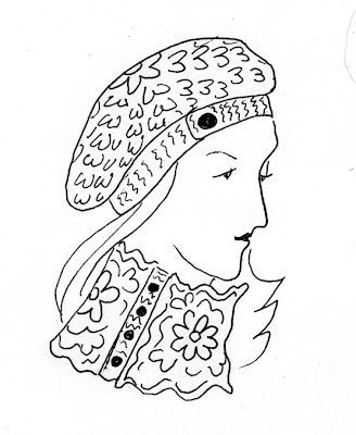
I'm submitting a proposal for a crochet pattern to an upcoming book. Typically, I submit a sketch, a swatch crocheted in the pattern I'm using, and a written description of the item. This (I hope you can tell) is for a slouchy hat and a cowl that buttons up the side. It's done in a fairly thick wool yarn.
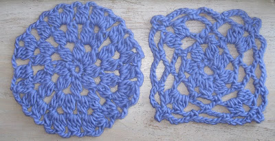
Just to give you and idea of what the fabric itself would look like, here are the swatches I made:
The most difficult thing for me about these kinds of sketches is getting the texture across (I rely on the swatch to help me out with that). Simple lines like these probably aren't the best way to do that. If I were trying to convey the concept using only the sketch, I'd be better off using something like charcoal or chalk that has a thicker, "fuzzier" feel to it that better represents the qualities of the yarn. Fortunately for me, editors aren't usually looking for artistic qualities in the sketch as much as something that conveys the concept of the finished design so until I'm a more accomplished artist, I'm keeping it simple.
Wednesday, June 30, 2010
Quick Studies
Three very quick sketches I did with a pen of my daughter. I wish she would hold still just a little longer! We used to do sketches like this as warm ups in art class--the model would pose for half a minute then change positions. But Irene is in constant motion and my drawing hand just can't keep up. Still, I used lines so at least that works with this week's reading!
Of the three, I like the lower left one best. I think I captured her posture and a little bit of her sturdiness.
Friday, June 25, 2010
Real Live Design Problem
Not very interesting images but these do actually reflect a design issue I'm working on right now. Coincidentally, it has something to do with balance. I'm designing and knitting a sweater for a book of children's knits. The sweater itself is very simple but I'm adding a flower motif using a technique called intarsia. I've finished the back of the sweater but I now have to decide what the fronts and sleeves will look like, i.e. where the flowers will be placed.
The pattern for the sweater will be available in several sizes, probably ranging from ages 2-14, but the flowers will remain the same size regardless of the sweater size. I'm also under some time constraint. The back took much longer to knit that I thought it would and the sample needs to get to the editor within the next week or so. The fewer flowers I include, the faster I can finish (and I really want to finish this thing--I'm sick of it!).
Tuesday, June 22, 2010
Irene Sleeping
This is a picture of my 16-month old daughter Irene asleep (at last!). I've captured something of her but it's not quite a good a likeness as I'd like it to be. Still, there is something very satisfying about drawing children, especially your own. Maybe it's just having the opportunity to stare at them and appreciate how beautiful they are.
I drew her by lamplight and I wish I'd been able to do a better job of capturing the shadows on her face. Also, I think the picture would have had a bit more depth if I'd made an effort to draw in the mattress and blanket behind her head but I was lazy and concentrating on her face which I found much more interesting. I cropped the picture to include the title/date as I rather like the extra negative space that's included. I think it's more interesting than it would be if I'd cropped it right around her face.
Friday, June 18, 2010
Lilies
Getting back into drawing after a very long time: a stem of lilies that Blue, my four-year-old, picked for me. I've always preferred drawing living things to other objects. Flowers (unlike children) hold still long enough for you to draw them.
The four elements of the picture aren't identical but they're of similar weight, style, color, and size which pulls them together. I didn't set out to consciously create a "composition"--I just wasn't really happy with the first sketch so I tried another, and another--but I think the four together make a nicer picture than any of them would alone. It makes them look more deliberate and it's a bit easier to overlook the flaws in any single sketch.
I cropped the original a bit but it's essentially the same as on the page. Because it's on a white background on the blog, you can barely see the edges of the image. I rather like the negative space within it but the complete lack of a frame leaves the images sort of hanging in space. (I tried adding a border to it but couldn't figure out how to do that in Fireworks--sigh!)
Subscribe to:
Posts (Atom)