Wednesday, August 4, 2010

Back Where We Started...


drawing flowers, this time hydrangeas from my garden. I would have drawn more, but it started to rain.

Tuesday, August 3, 2010

Project 4: Book Cover


My original sketch and final version of Project 4.
(I'm done! I'm done! I'm done!)

Monday, July 26, 2010

What Not To Do


In light of our next assignment, my fellow GDS 108-ers may enjoy the Good Show Sir blog :)

Monday, July 19, 2010

Map for Project 3


Here's my map at Stage II. The idea is for WUNA to have a map the promotes the "neighborliness" of the area as well as gives a nod to its history.

The logo in the upper left is the real WUNA logo. I don't think it's very pretty but since it exists I used it. I'm not thrilled with my little buildings. Ideally, I'd like to have tiny outline sketches of the actual buildings but I think that would be way too much work for this particular project. Maybe they'd be better as little three-dimensional boxes?

I won't be in class on Tuesday for the critique, so feel free to leave comments and suggestions here. Thanks!

Sunday, July 11, 2010

Another proposal


Another sketch for a crochet design proposal. This one is for a corset-style top that laces up the front and has a frilly trim along the bottom. Since there is a lack of adult women willing to pose for me, I looked at a model in a catalog while I was drawing this to try to capture a reasonably life-like pose. Her proportions are a bit off (the fault of the drawing, not the model) but it gets the idea across well enough, I think.

Friday, July 2, 2010

Crochet Proposal

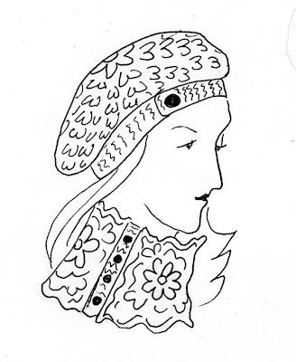
I'm submitting a proposal for a crochet pattern to an upcoming book. Typically, I submit a sketch, a swatch crocheted in the pattern I'm using, and a written description of the item. This (I hope you can tell) is for a slouchy hat and a cowl that buttons up the side. It's done in a fairly thick wool yarn.
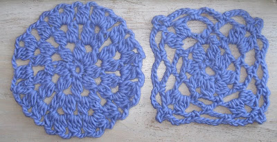
Just to give you and idea of what the fabric itself would look like, here are the swatches I made:


The most difficult thing for me about these kinds of sketches is getting the texture across (I rely on the swatch to help me out with that). Simple lines like these probably aren't the best way to do that. If I were trying to convey the concept using only the sketch, I'd be better off using something like charcoal or chalk that has a thicker, "fuzzier" feel to it that better represents the qualities of the yarn. Fortunately for me, editors aren't usually looking for artistic qualities in the sketch as much as something that conveys the concept of the finished design so until I'm a more accomplished artist, I'm keeping it simple.

Wednesday, June 30, 2010

Quick Studies

Three very quick sketches I did with a pen of my daughter. I wish she would hold still just a little longer! We used to do sketches like this as warm ups in art class--the model would pose for half a minute then change positions. But Irene is in constant motion and my drawing hand just can't keep up. Still, I used lines so at least that works with this week's reading!

Of the three, I like the lower left one best. I think I captured her posture and a little bit of her sturdiness.