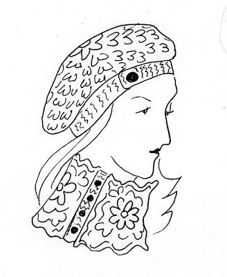
I'm submitting a proposal for a crochet pattern to an upcoming book. Typically, I submit a sketch, a swatch crocheted in the pattern I'm using, and a written description of the item. This (I hope you can tell) is for a slouchy hat and a cowl that buttons up the side. It's done in a fairly thick wool yarn.
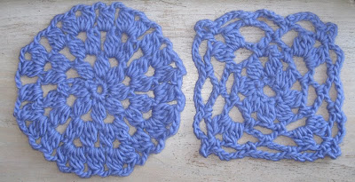
Just to give you and idea of what the fabric itself would look like, here are the swatches I made:

The most difficult thing for me about these kinds of sketches is getting the texture across (I rely on the swatch to help me out with that). Simple lines like these probably aren't the best way to do that. If I were trying to convey the concept using only the sketch, I'd be better off using something like charcoal or chalk that has a thicker, "fuzzier" feel to it that better represents the qualities of the yarn. Fortunately for me, editors aren't usually looking for artistic qualities in the sketch as much as something that conveys the concept of the finished design so until I'm a more accomplished artist, I'm keeping it simple.


 I'm submitting a proposal for a crochet pattern to an upcoming book. Typically, I submit a sketch, a swatch crocheted in the pattern I'm using, and a written description of the item. This (I hope you can tell) is for a slouchy hat and a cowl that buttons up the side. It's done in a fairly thick wool yarn.